|


REALITY CHECK, PLEASE!!
NATIONAL DEBT:
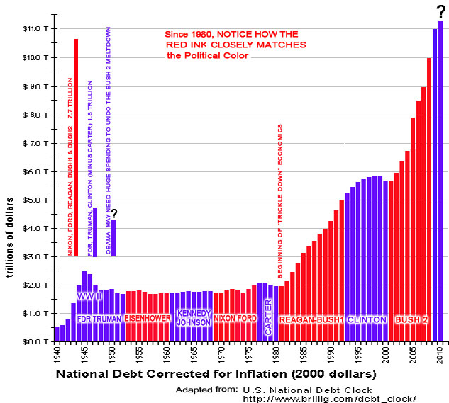
For those suddenly concerned with the Federal Budget Deficit, Taxes, Salaries, Job Creation, &/or Economics • The 2010 Budget includes about 1 Trillion to just pay interest on the 7.7 Trillion Republican Deficits • U.S. Debt: $30,000 per American, so using the totals from the chart above, the Republicans ran up 7.7 Trillion, and everyone else throughout history, or call it the Democrats: 1.8 Trillion. That's a 76% to 24% ratio, so the above mentioned $30,000 per American boils down to: $22,800 for the Red Ink Party, & $7,200 for the Democrats. Obama probably will have to run up even more debt to pay for the Wars, Economic Meltdown and Bush Tax Breaks For The Wealthy, and remember, a big part of every budget is the $1 Trillion in interest on that $7.7Trillion brought to you by Reagan-Bush1&2 WAGES:
READ MORE AT: |


![]()